
From One-Offs to One System: Building Klods for LEGO
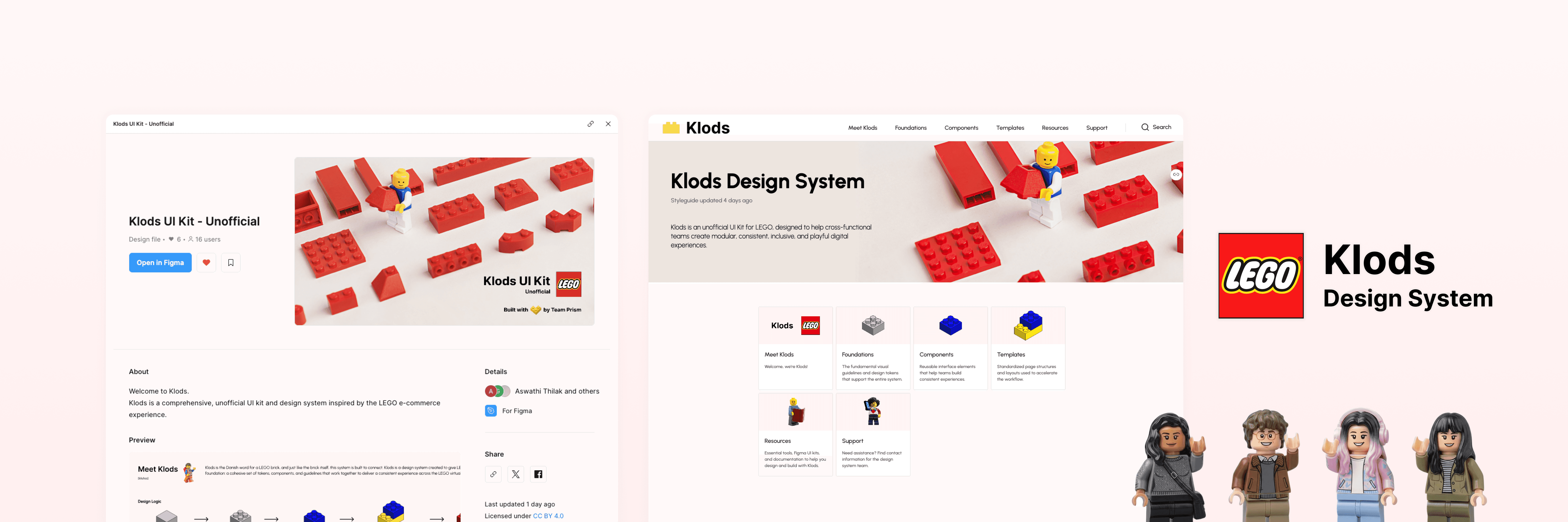
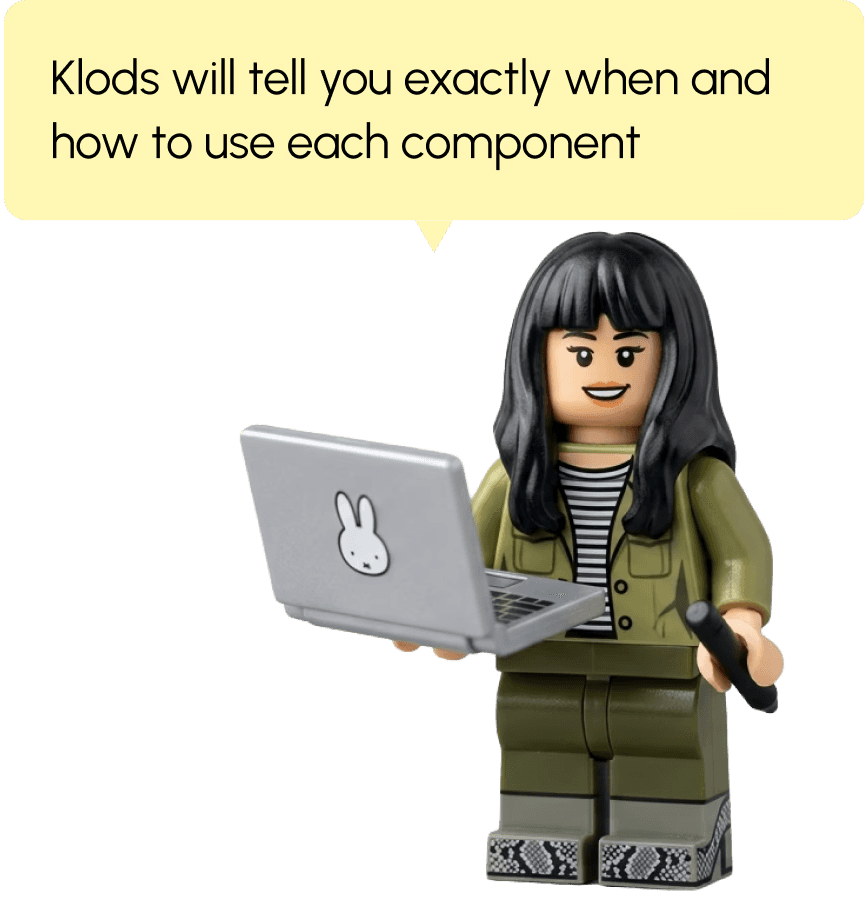
Klods [kluhss, Danish for "brick"] is our unofficial answer: a design system built on four principles, consistent, modular, inclusive, playful.
It pairs a Figma UI kit with a documentation site, giving LEGO designers one shared set of bricks to build from.
Client
LEGO
(Independent Project)
Timeline:
Feb - May, 2026
Team:
3 Product Designers
Skills
UI/UX design
Documentation
User Testing
Problem
Why does LEGO need a Design System?
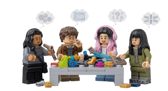
At first glance, LEGO's website looks fun and nice.
But when we looked closer, the cracks were showing. And as design students learning systems thinking, we couldn't unsee them!
From this process, three problems kept surfacing across every page:
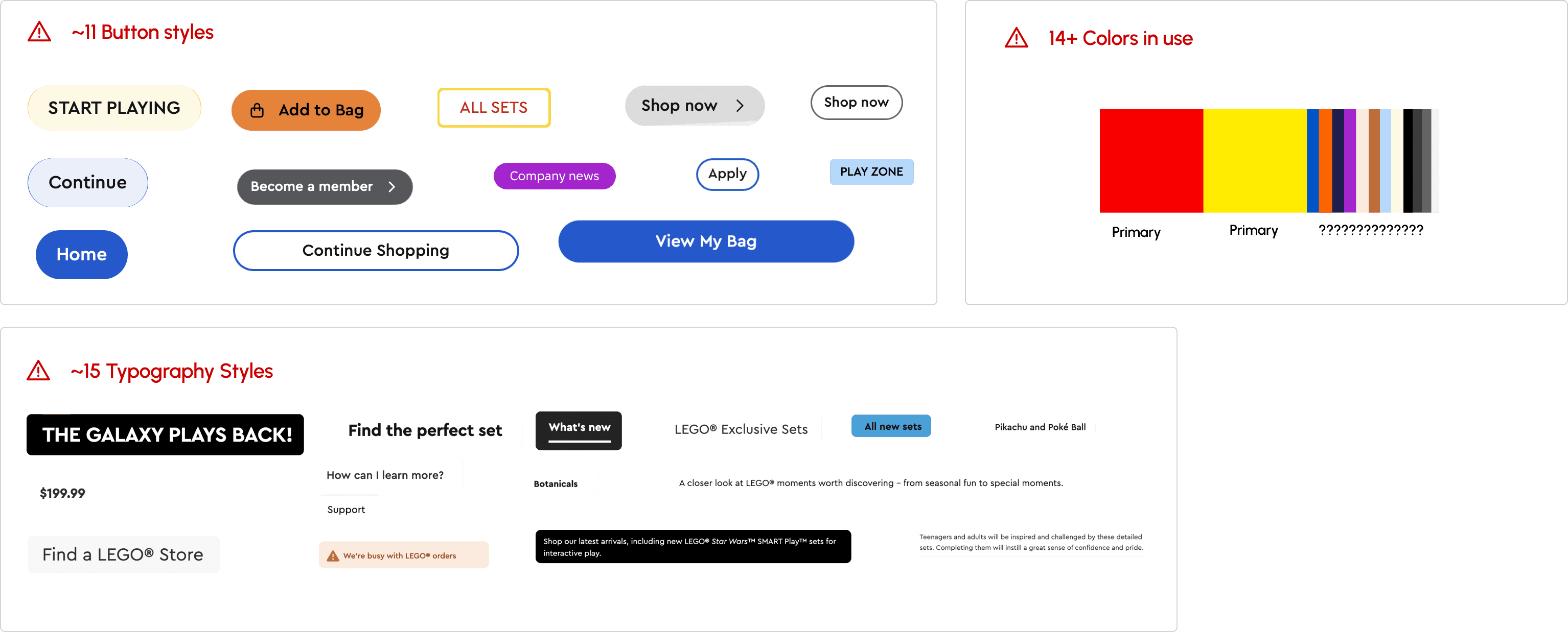
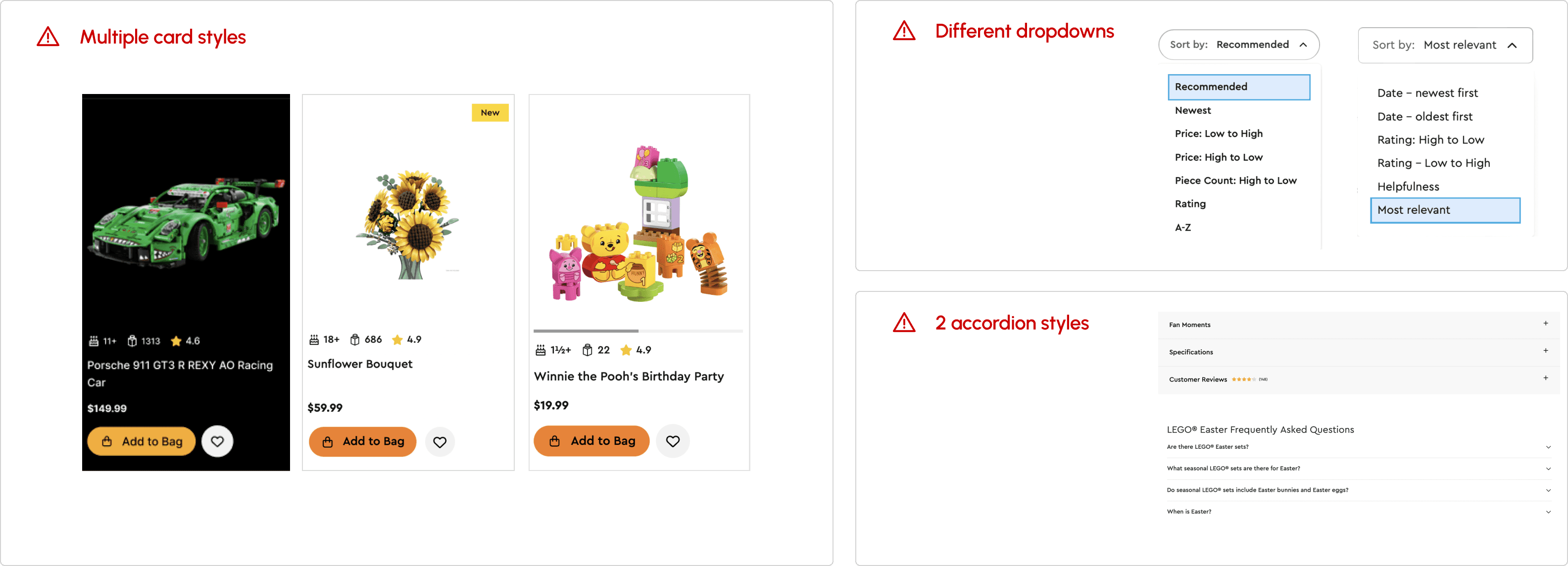
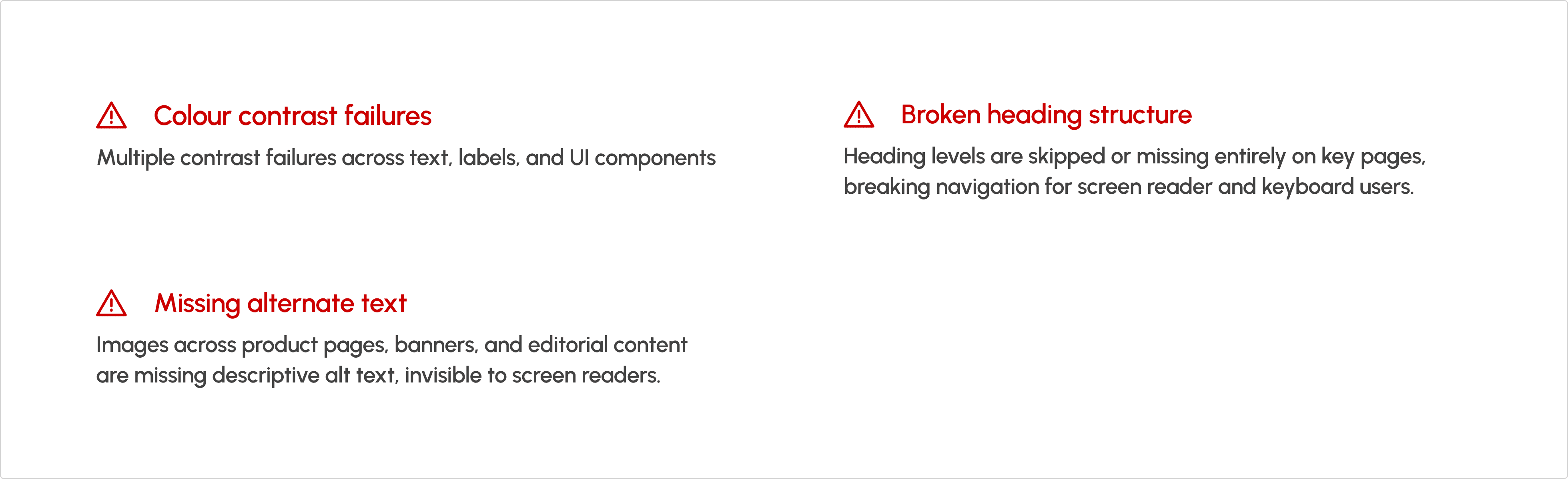
Three problems, one root cause. We realized that the pieces were all there. They just weren't snapping together.
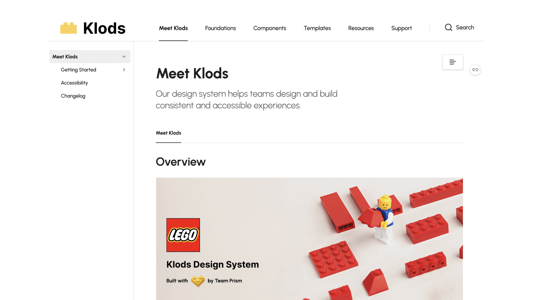
Design Solution: Klods
Introducing Klods
A design system that snaps together like the brand it's built for.
Klods [kluhss, Danish for "brick"] is built on four principles, consistent, modular, inclusive, and playful, all working together to give users one shared foundation to build from.
Also watch our quick demo of using Klods UI Kit!
What's in the box:
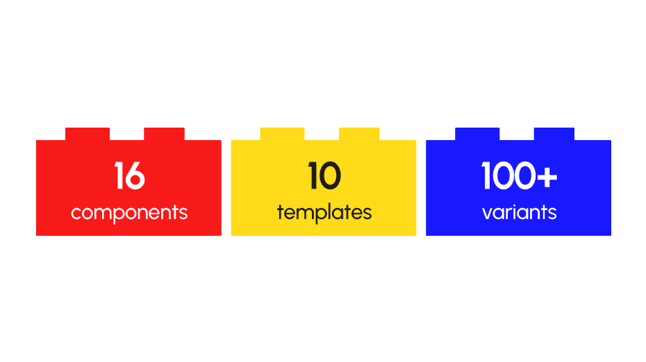
We delivered Three artifacts, One system. Klods is built to work together.
The piece I owned
Our team shared most roles equally. The piece I specifically owned throughout the process was making sure every component actually followed the foundations we'd built.
Setting up the foundation was the easy part. Catching the small drifts (a color outside the palette, a spacing rule eyeballed, a typography style approximated) was the tedious one.
But it's what kept the foundation doing its actual job!
The values stacked behind Klods
Before we built anything, our team agreed on four principles to guide every decision:

Modular
Every piece designed to connect. Components, templates, and tokens combine like the brand they're built for.
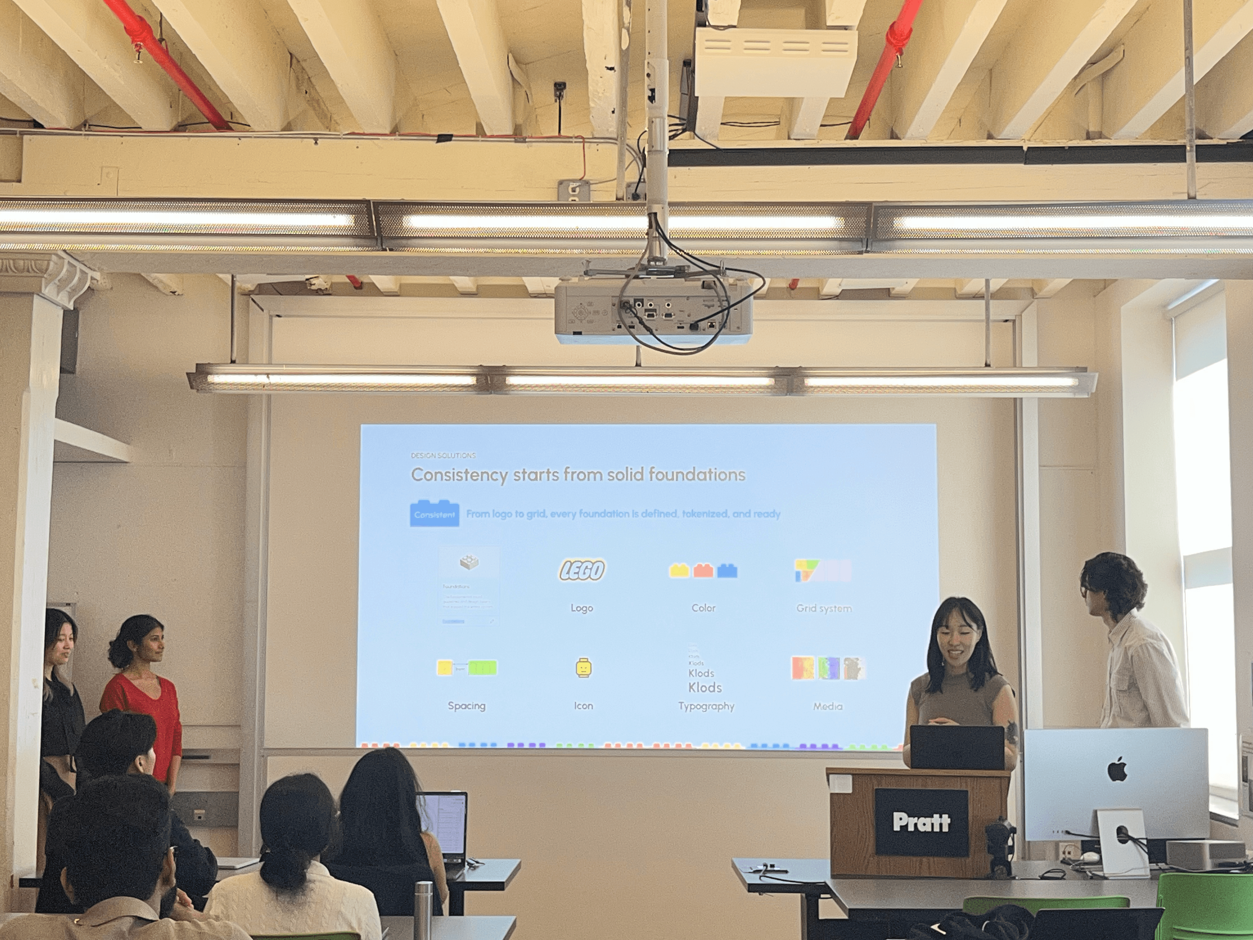
Consistent
Shared tokens, components, and patterns. Every team builds from the same foundation, no more one-off decisions.

Inclusive
Built to WCAG 2.1 AA from the start. LEGO is for everyone, and the digital experience should be too.

Playful
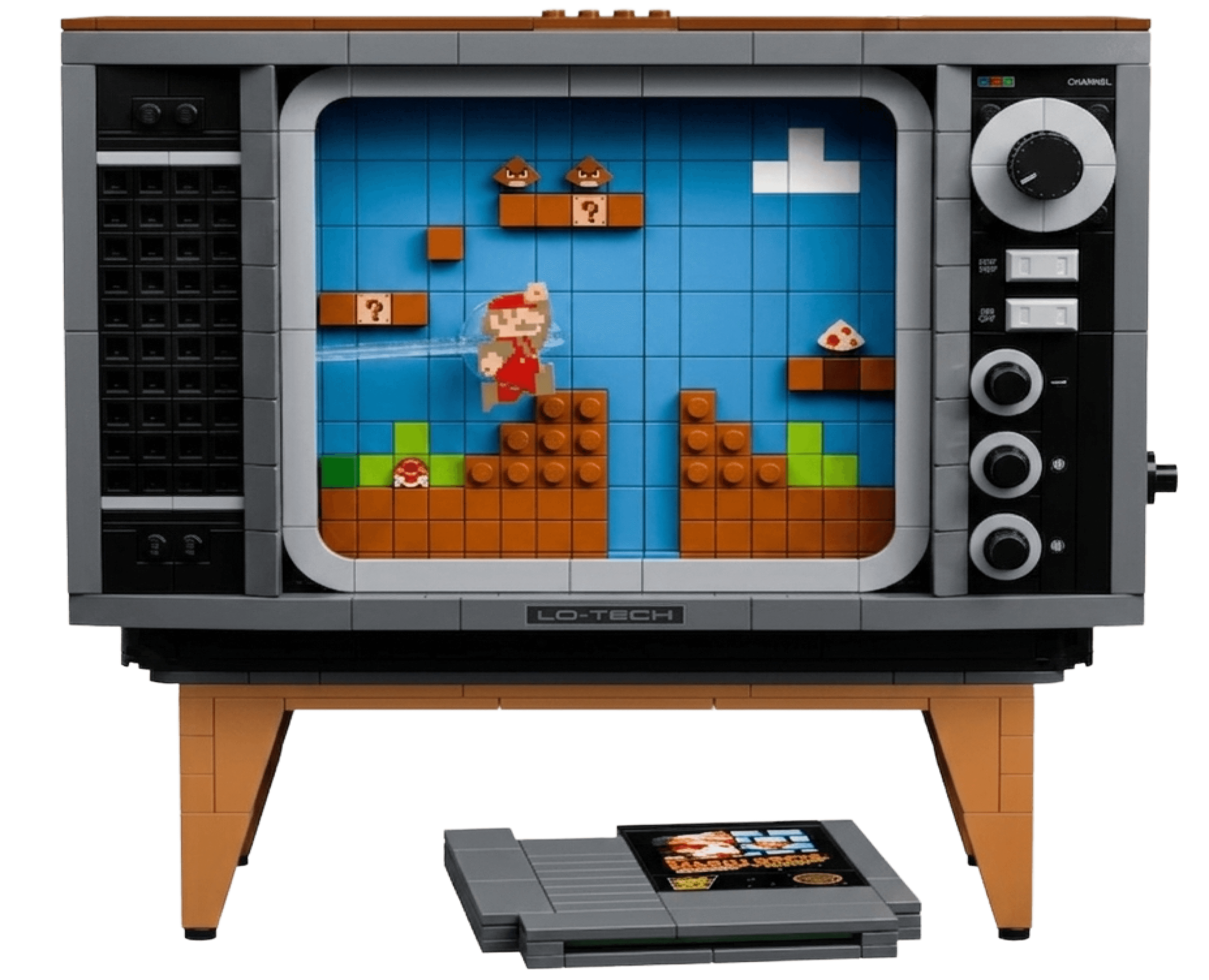
LEGO is known for its signature playfulness, and we want to ensure our digital experience also conveys that.
Inside Klods
Designing from atoms to molecules
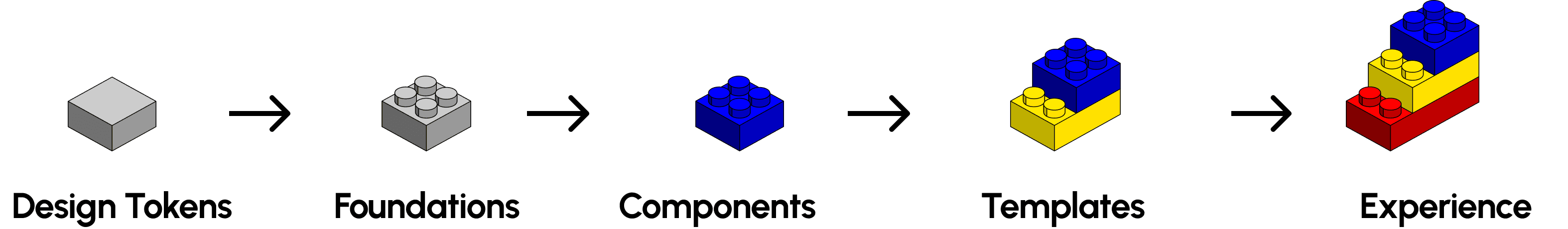
Klods follows atomic design logic.
Foundations stack into components, components into templates, and accessibility and play are baked into all of it from the start.
Building the foundation, Brick by Brick
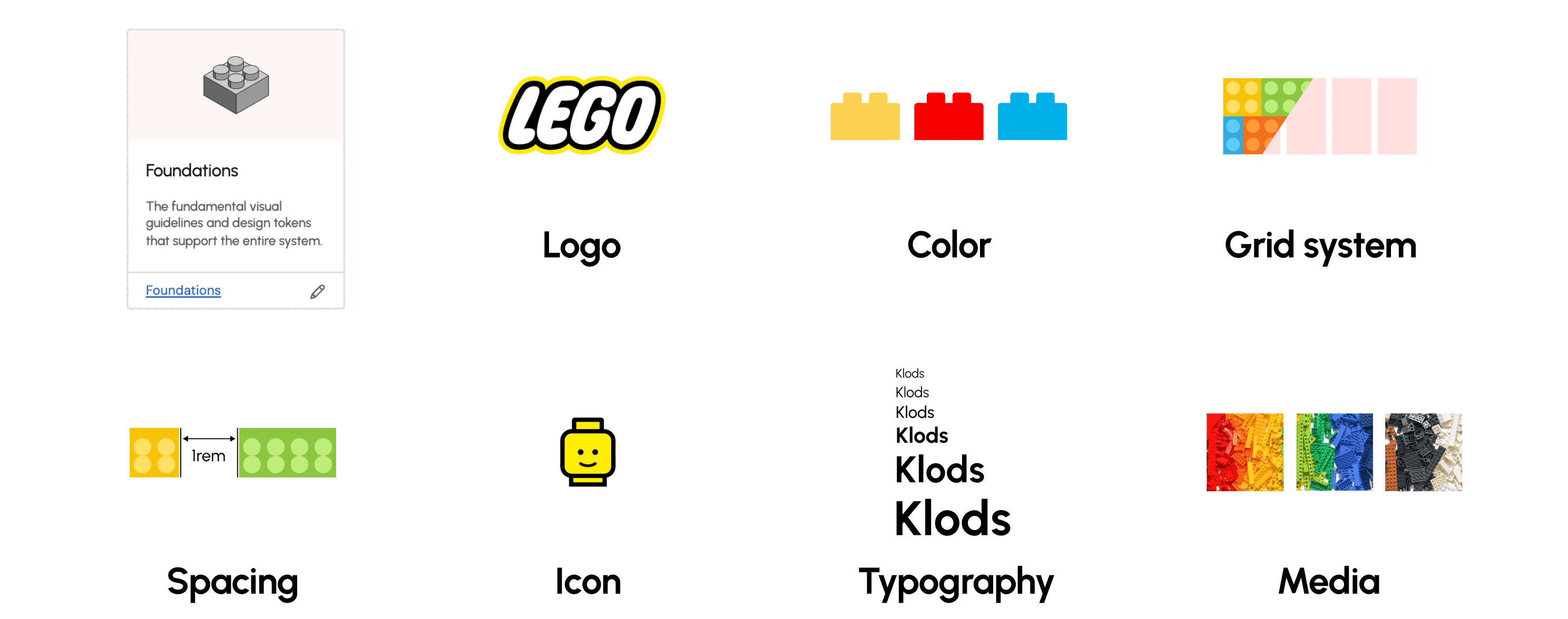
Before we built a single component, we defined the rules.
Klods starts with seven foundational pieces: logo, color, grid, spacing, typography, icons, and media. Each tokenized, each documented, each acting as the single source of truth for everything that comes next.
Stacking foundations into components
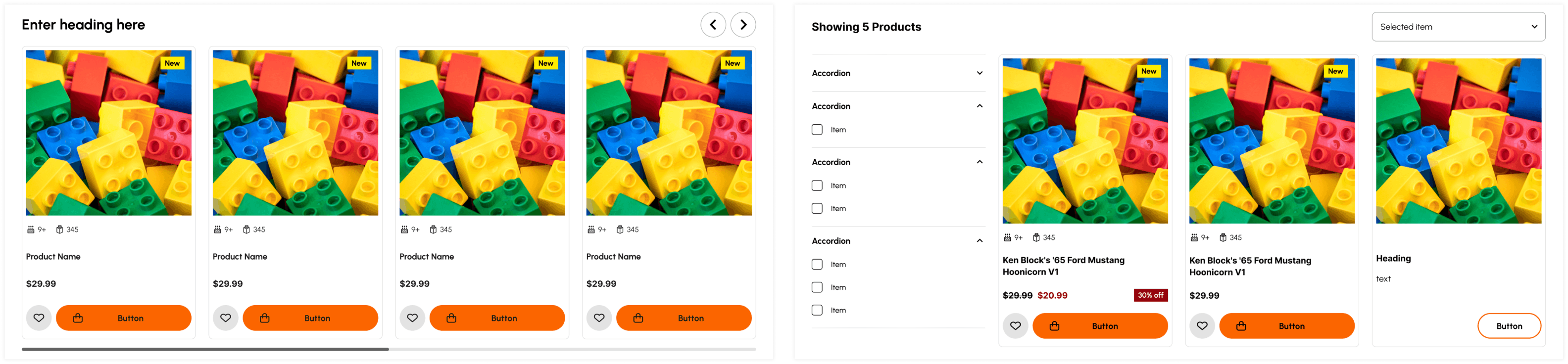
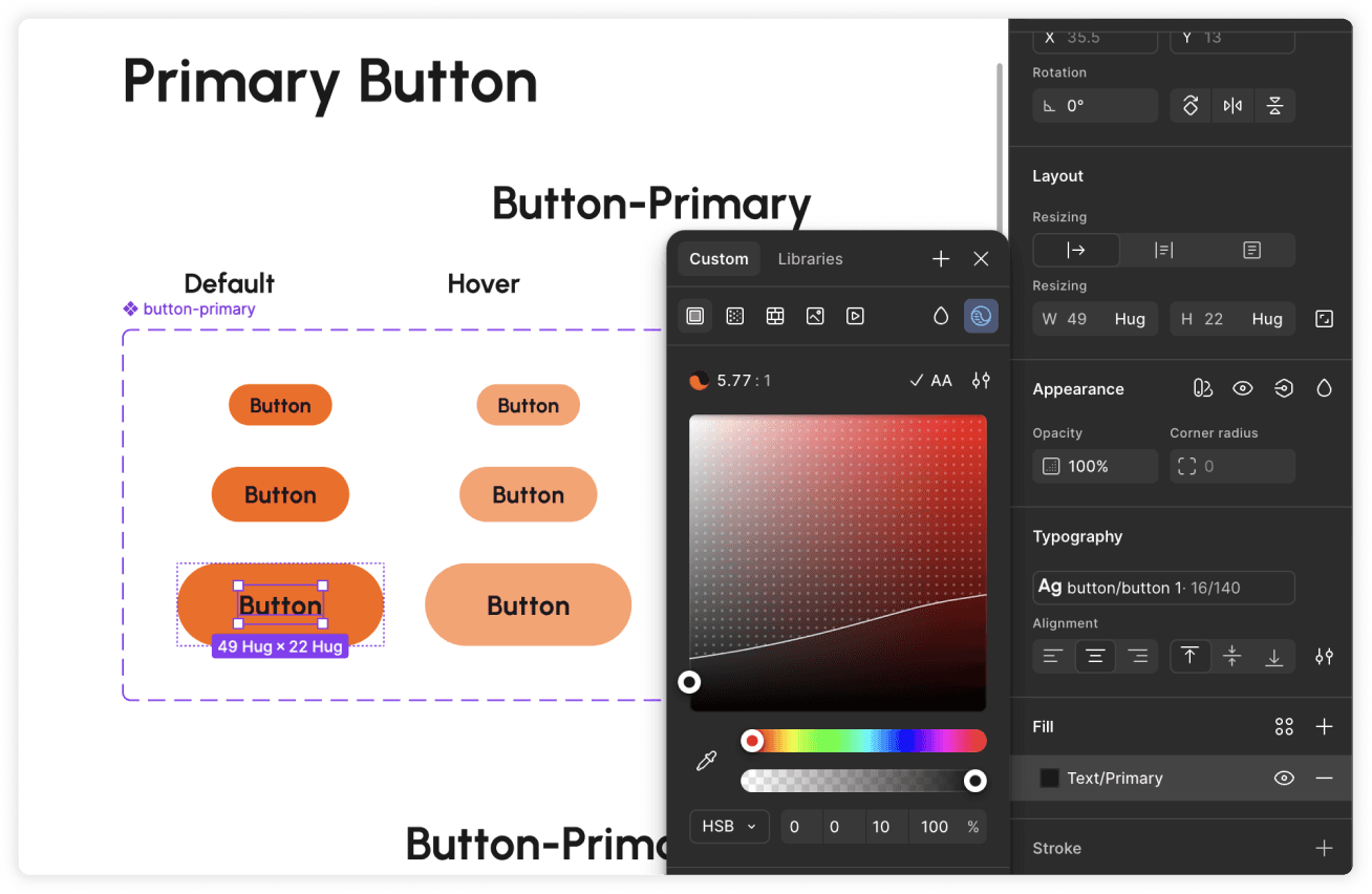
With the foundation in place, we used it to build 16 components and 100+ variants.
Every component is assembled from foundation tokens, not custom values: the same color palette, typography hierarchy, and grid system holding everything in place.
Update the foundation once, and every component using it updates with you.
Hover over to see the grid system snapping each piece into place underneath!
On the surface, you see a clean, consistent interface. Under the hood, it's the foundation doing the work.
This is also the part I owned closest. A component that hardcodes a value looks the same as one that doesn't, right up until you need to change something!
Templates: pages that build themselves
Components are the bricks. Templates are the sets they build.
Templates
Mock up section
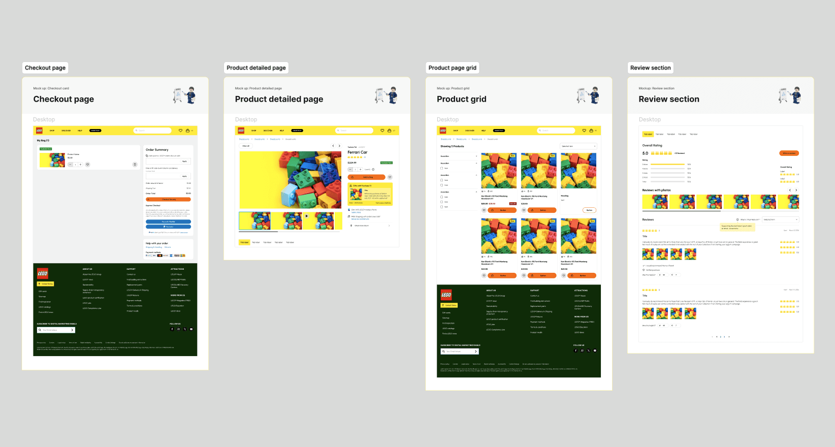
Klods includes 10 templates for the layouts every team needs over and over: navigation, modals, carousels, checkout pages, product detail pages, and more. Each one is assembled from components, which are built from tokens. A designer can drop into any template and inherit every rule that came before.
We don't lets user start from scratch, we let them start from a working page.
Built for everyone
95.9% of the top one million homepages fail WCAG 2 standards. Most of those failures come from the same component errors, repeated across hundreds of pages.
Every design passes WCAG 2.1 AA contrast ratio
Font size designed for readability
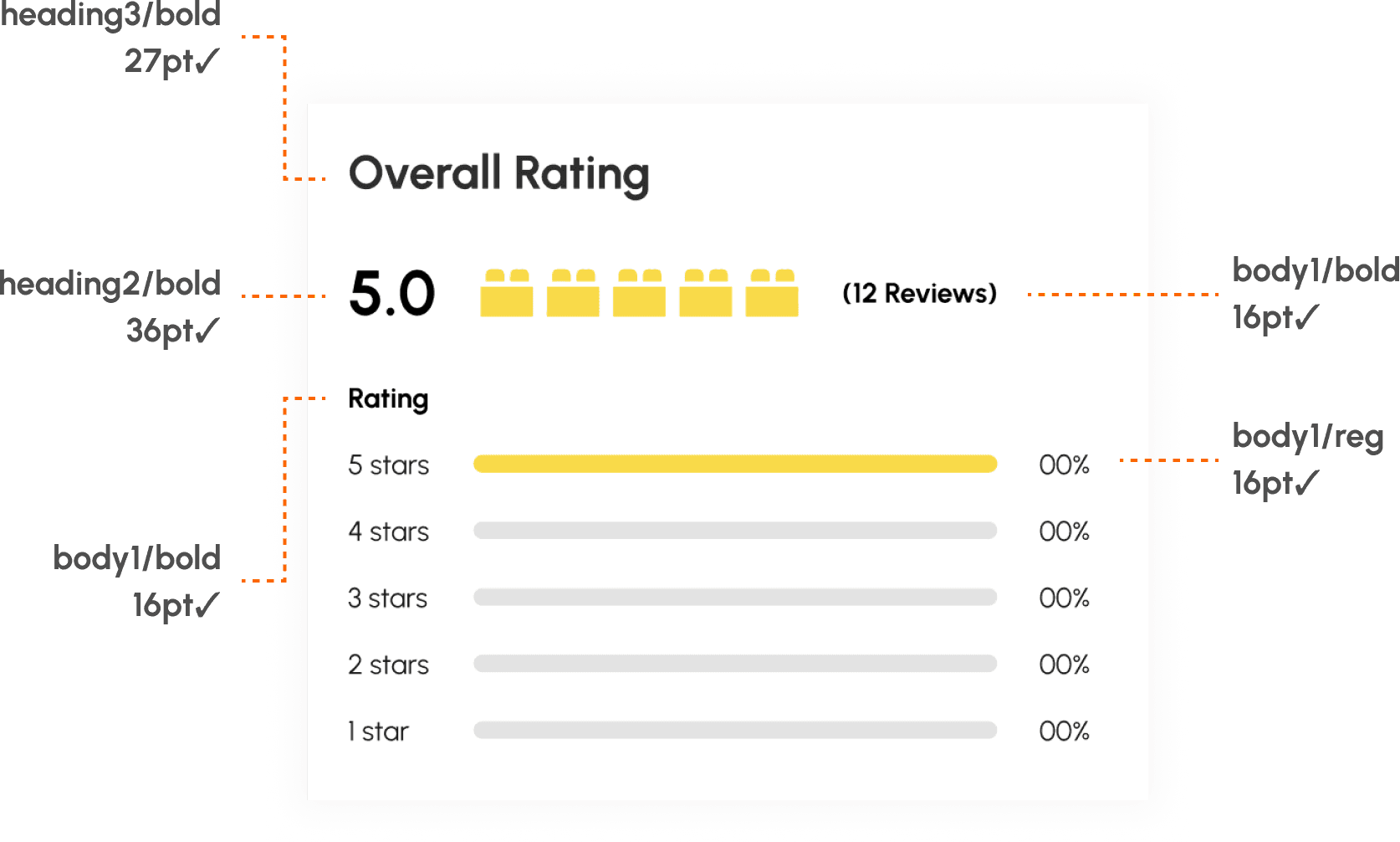
Klods is built to WCAG 2.1 AA, with AAA as the target wherever clarity allows. Every component passes contrast. Every typography size meets readability minimums. Every interactive element has clear focus and hover states.
Play in the details
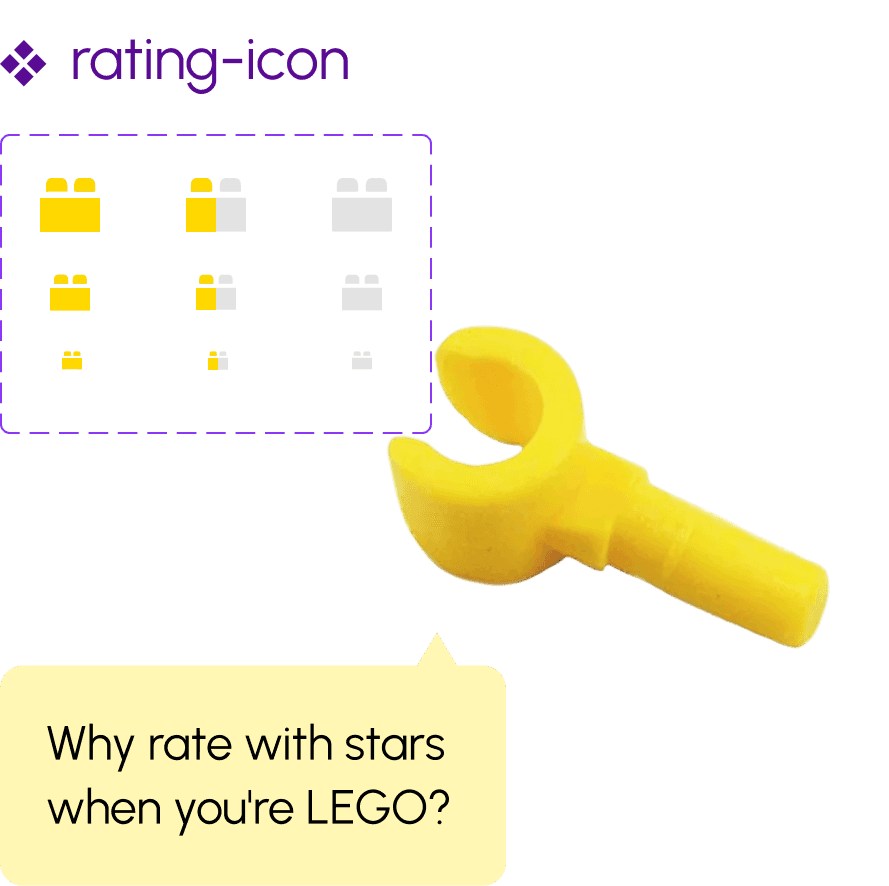
Playful is the easiest principle to talk about and the hardest one to actually build. It can't be slapped on as decoration. It has to live in the details the system itself ships with.
For example, we use bricks instead of stars for rating widget. Icons borrow from LEGO's visual language.
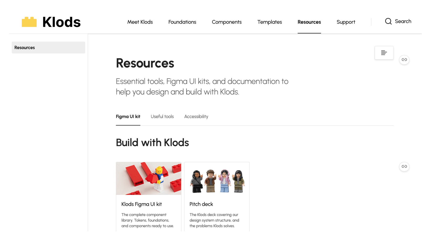
Documentation
Design system doesn't end with the UI kit
We thought the UI kit was the system. Building one taught us it wasn't!
We built the documentation on Zeroheight, a platform made for design systems. It let us keep every piece of Klods (components, guidelines, resources, and contribution paths) in one searchable place.
Every brick in Klods comes with instructions
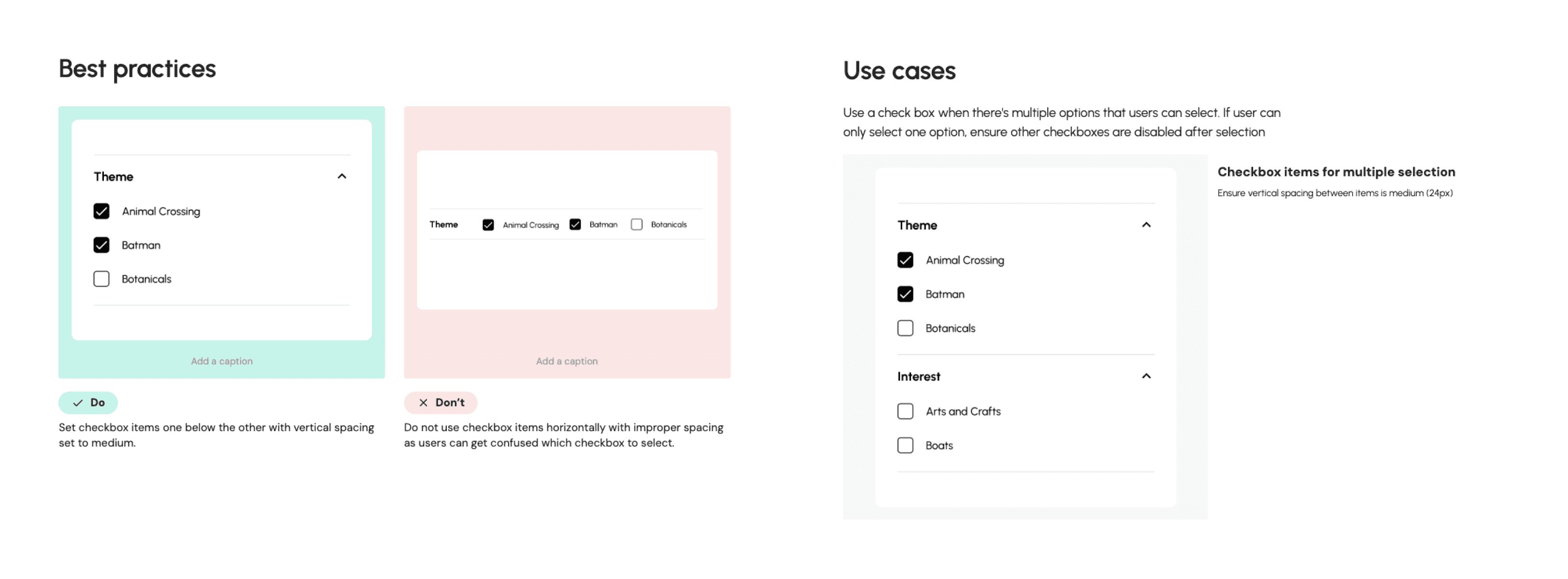
We learned that "here's a checkbox component" isn't enough. Users need to know when to use it, how to space it, and when to reach for something else. So every component in Klods ships with do's, don'ts, and use cases.
Tools we collected along the way
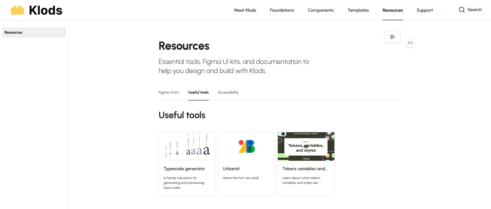
The tools and references we leaned on throughout the project, all in one place. Type generators, accessibility checkers, token system guides. Less hunting for the next team.
Built to keep growing
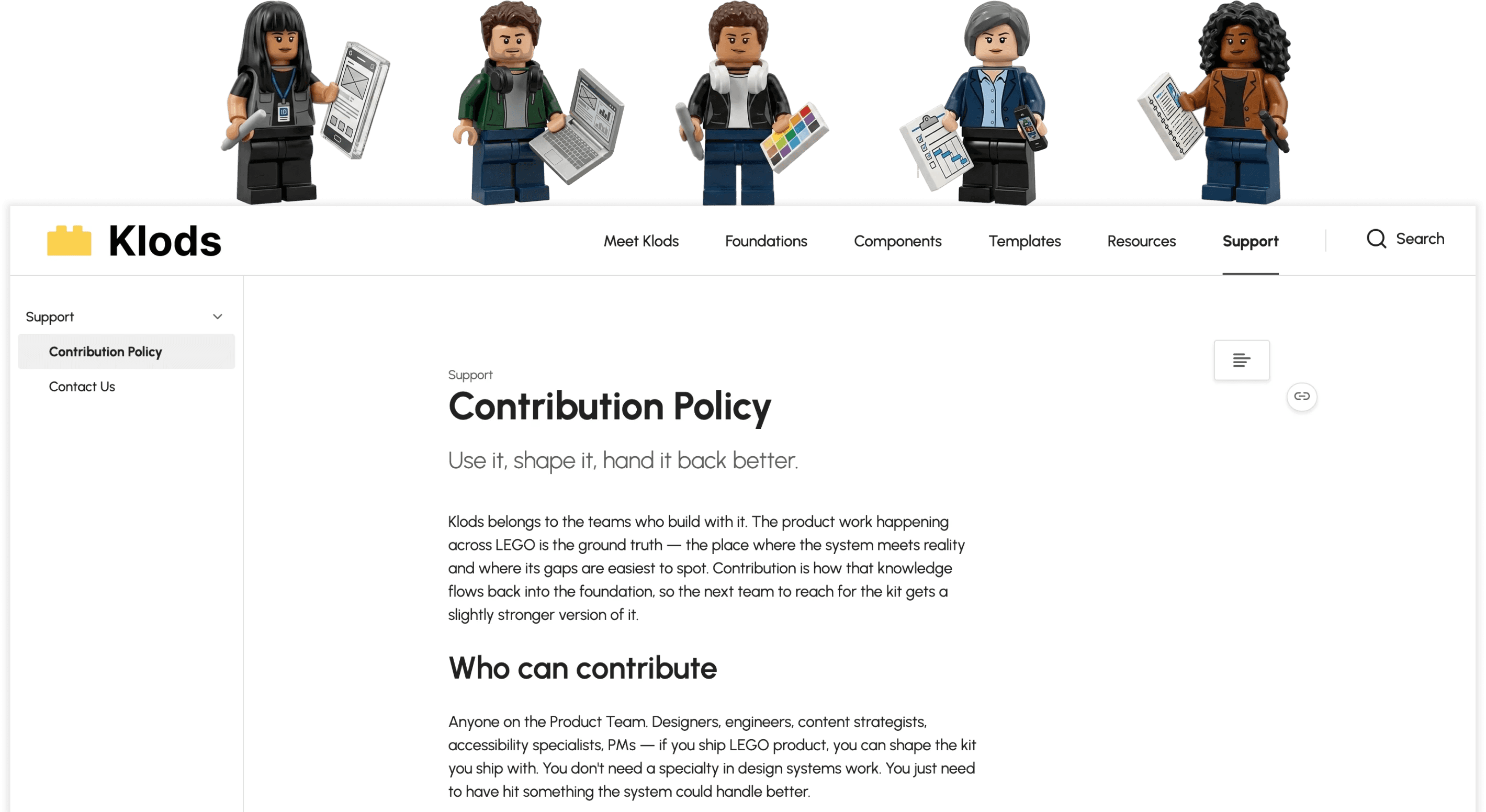
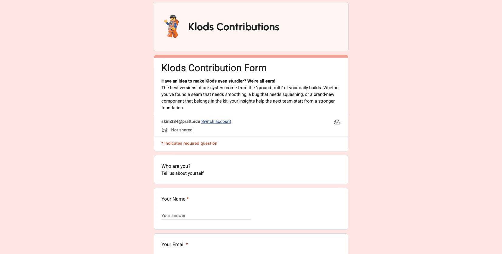
A design system that doesn't change is a system that dies. So we set up a contribution policy and form so anyone using Klods can propose new pieces, flag bugs, or update what's there. The kit gets stronger every time someone adds to it.
Explore the full Klods documentation on Zeroheight →
Test & Iteration
Guerilla Testing with fellow UX designer
we ran a guerrilla test with a fellow UX designer outside our team.
The brief: try building a simple LEGO product page / checkout page using what's in the UI kit.The goal wasn't to validate Klods. It was to find what we couldn't see anymore after staring at our own work for weeks!
Takeaway
Added templates to the kit
Components alone weren't enough. Designers wanted pre-built pages to start from instead of building every layout from scratch.Added mockup sections
Seeing components in isolated frames wasn't the same as seeing them in a real product context, so we added mockup examples to the kit.Rethought the kit's information architecture
The kit had too many groupings, which overwhelmed designers trying to find what they needed. We merged related categories so the list was easier to scan.
Wrapping Up
Making our pitch:
Promoting it to the audience!
We presented Klods as our final class pitch.
The audience: fellow designers and professors playing the role of fictional LEGO stakeholders, giving feedback on clarity, structure, and how Klods would land on a real product team.
"Loved the playfulness throughout,
it made the whole pitch feel alive!"
"Strong connection and flow from problem to solution"
We received positive feedback from the room. The pitch worked because we matched the brand we were pitching for: playful in tone, structured underneath, with each section building into the next.
A note: this presentation was a course final. Classmates and professors gave feedback as stakeholders, which helped us see Klods through the lens of someone outside the build. The project itself is independent and unaffiliated with LEGO.
Reflections
What I learned
A design system is built once and maintained forever.
The foundation work I owned was solid on day one, but components kept drifting away from it throughout the project. Catching those drifts was the most tedious work I did, and also where I realized how design systems actually fall apart in practice: not because no one builds them, but because no one watches them after!
Four designers caught what one couldn't.
Working as Team Prism, we constantly caught gaps in each other's work: a token that wasn't applied right, a use case we hadn't covered, an accessibility check we'd skipped. That kind of cross-checking is what keeps a system honest. I don't think a solo designer could have shipped this with the same rigor.
This was Klods
Thanks for stepping in!
P.S. Thank you Ash, Federico, Grace! Truly amazing teamwork!