
MedLaunch Concepts:
When usable doesn't mean simpler
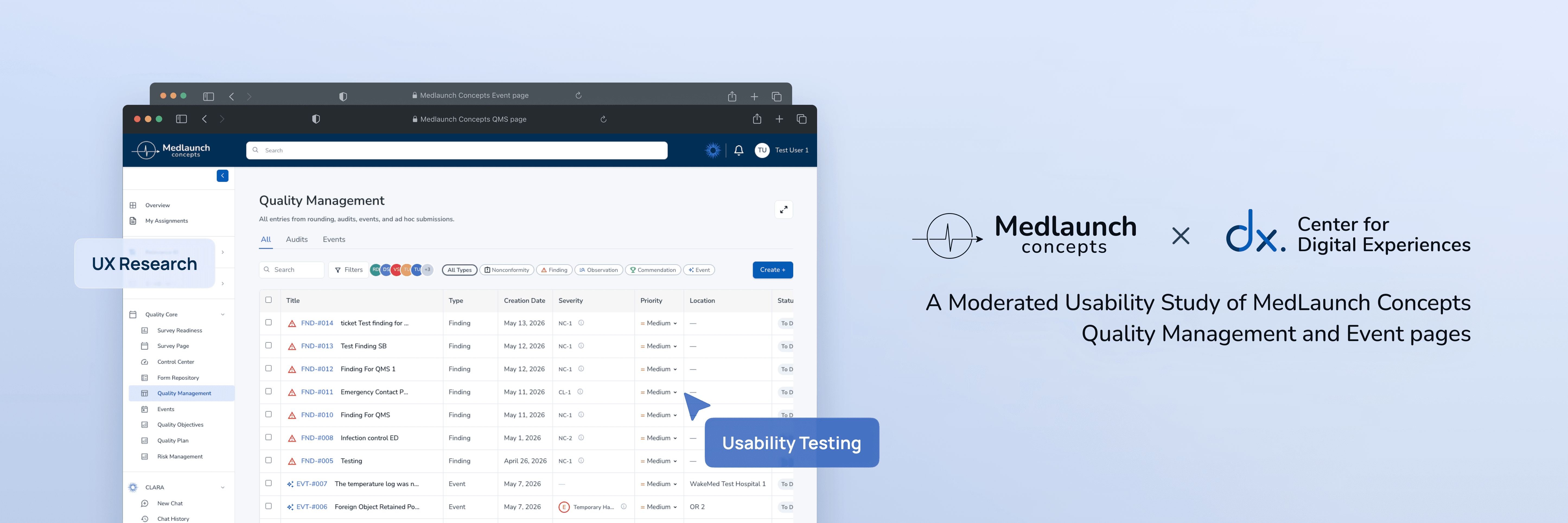
MedLaunch Concepts is a healthcare technology startup developing the DNV Healthcare Portal, a platform designed to replace outdated accreditation systems that have long frustrated hospital surveyors and compliance officers.
Our team conducted eight moderated usability sessions to find where the new portal still got in the way of work that affects patient safety.
Client
MedLaunch Concepts

Timeline:
Apr - May, 2026
Team:
4 UX Consultants
Skills
Moderated
Usability Testing
Recruitment&Screening
Prototyping
Introduction
Who is MedLaunch Concepts?
The platform behind hospital accreditation
https://www.medlaunchconcepts.com/
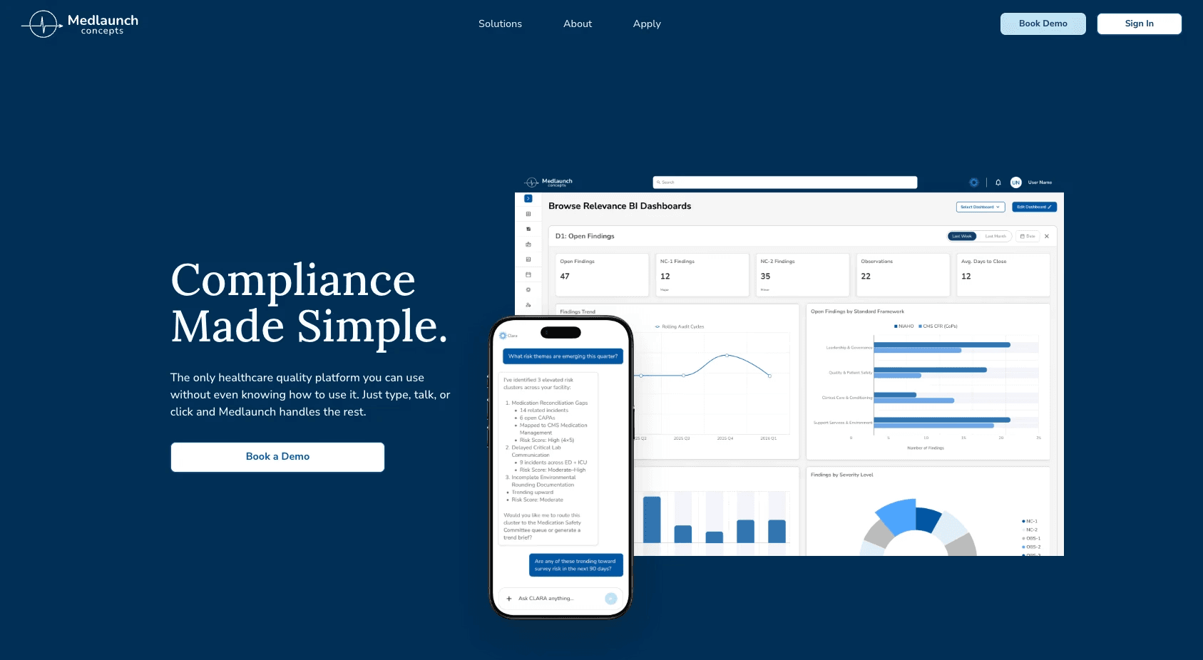
MedLaunch Concepts builds software for healthcare compliance: accreditation organizations, hospital systems, and healthcare enterprises.
Their Quality Management page is the workhorse, where users document compliance issues, manage corrective actions, link related records, and report safety events. The work is detailed by necessity, and the documentation has to keep up.
Consulting through the Center for Digital Experiences

Our team came in as UX consultants on behalf of the DX Centre.
The platform was in active development, and MedLaunch wanted to know where the friction actually lived before it shipped.
What I contributed to the team:
Recruited and screened participants using Private Panel with the team
Moderated 2 of 8 usability sessions
Analyzed the finding and communicate with the team
Studied, analyzed, and wrote the Methodology section and Finding & Recommendation 3
Designed mockups for Findings and Recommendation 2 and 3
Kick-off meeting with client!

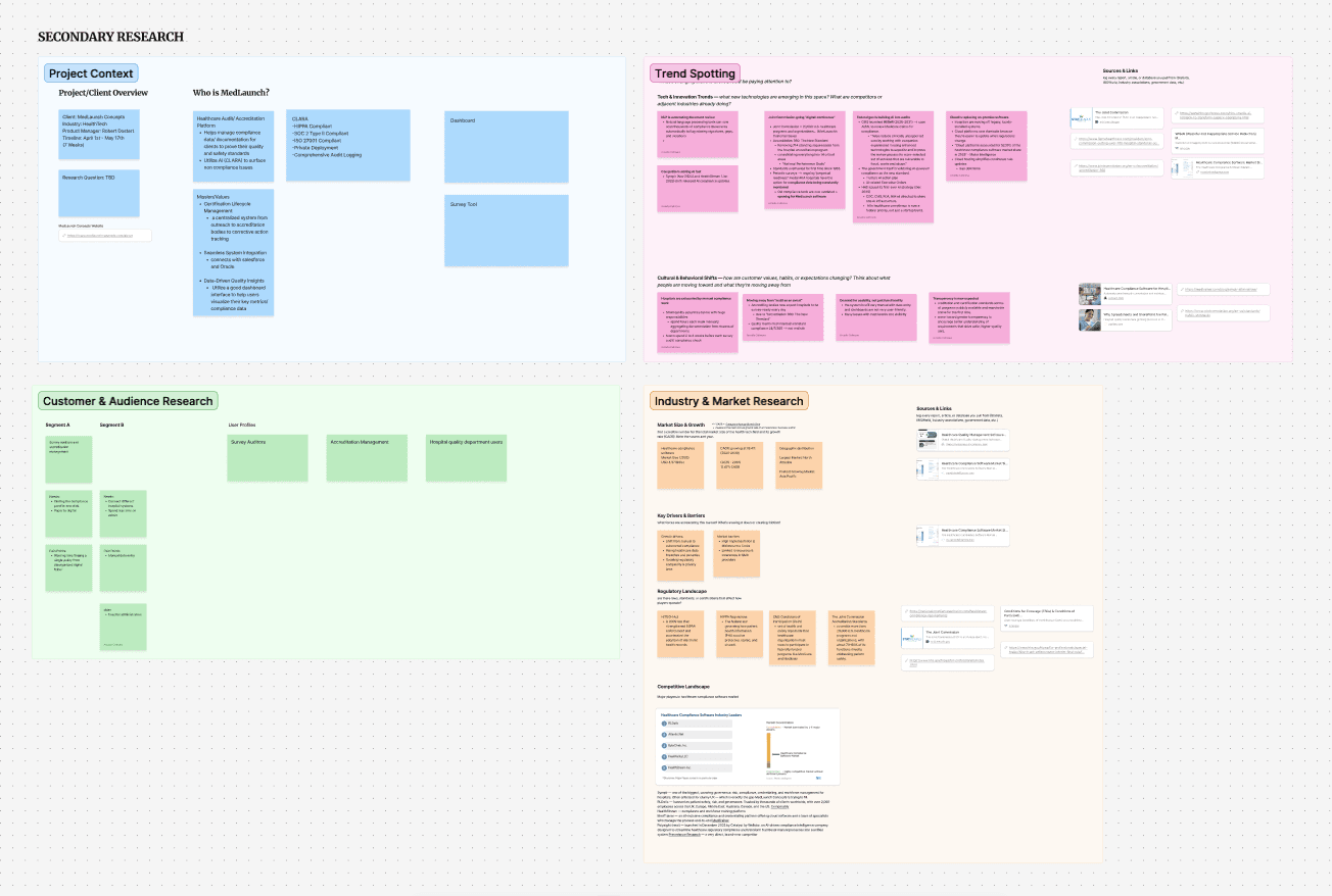
Team JAAR + secondary research board
First time meeting our client, we delivered our questions and did secondary research to understand the product before we got into usability testing.
Challenges and Learning Pt.1
"Wait team, I still don't know what hospital compliance does!" — Me, in the first week.
Before we could write a research plan, we had to understand the system ourselves. The page was dense. The vocabulary was specialized. We spent days clicking through the demo and learned what an auditor's day actually involves.
It was the first time any of us had worn the boots. And we wouldn't have noticed half of what we found later if we hadn't.
Usability Testing Preperation
Designing the study
Mixed methods for a moving target
Because the platform was actively being developed, we designed the study as a mixed-methods evaluation. Two parts, doing different jobs.
Research method and data collection
Formative, qualitative.
We needed to understand the why behind every moment of friction. We built sessions around scenario-based tasks with think-aloud narration, then asked follow-up questions. What did you expect? Where did you hesitate? What were you looking for next?
Quantitative.
We needed structure to compare across sessions. After each task, participants rated difficulty on a 7-point Single Ease Question scale, and we marked completion as Pass, Partial, or Fail. Those numbers don't tell you what's wrong. They tell you where to look.
Recruiting the right mix

Private Panel Dashboard
Finding direct hospital surveyors was hard. We screened for current or recent experience in healthcare administration, quality management, compliance, hospital accreditation, project management in regulated environments, or a related field. That last phrase mattered.
We ended up with a mix:
2 direct users: hospital surveyor/auditor who'd done survey work
6 adjacent users: a lab manager with regulatory exposure, a localization engineer lead, a product designer, a software engineer, and healthcare-pharmacy admins not doing compliance day-to-day
Challenges and Learning Pt.2
The system was changing under us.
We started designing tasks before we fully understood the product, and the platform kept updating as we worked. Suddenly a button moved, a label changed, and our task script was out of date.
What we did: Communication
We set up a Zoom call with the client right away. We sat down with the UX/UI team for a closer walkthrough, then built our script around the parts of the product that were stable. From then on, we kept a direct line open and asked the questions early instead of guessing.
Four tasks, walking through a surveyor's day
The main four tasks were designed to simulated a hospital surveyor's day:


What we found
Three frictions, three different shapes
After eight sessions, our team had something honest to report.
Most of what we saw was working. Participants called the platform "mature" and "learnable." A few said they'd be comfortable using it for real work after one training session.
But three things kept surfacing across sessions. None of them were bugs. Each one was its own kind of friction.
Finding 1: A button hiding behind a scrollbar
The first surprise was the completion-rate cliff.
Every participant completed Task 1 (create a new entry) without help.
Then they hit Task 2: locate the "Start Effectiveness Monitoring" button for an existing issue. Seven out of eight could not finish without moderator guidance.

1: Narrow Side Panel - Side panel width limits the visibility of the Actions table content

1: Lack of scroll indicator - No visible scrollbar to indicate the table is horizontally scrollable.
2: Hidden off-screen content - "Start Monitoring" button only reachable by scrolling horizontally.
The CTA existed. It worked, but it was also invisible.
Inside an entry's side panel, the Actions table extends horizontally beyond the visible width. The Effectiveness Monitoring button sits to the right of the cutoff. No visual hint that anything more was there.
"You wouldn't know the scroll was there if you're just using your mouse. There's not even a scroll bar."
— Participant 6
Recommendation 1: Make the button findable

1: Wide Side Panel - Opening an entry ticket expands the side panel into a wider, adjustable view for easier access to key elements.
2: Horizontal Scroll Bar- allows users to drag across the Actions table to reach hidden buttons.
Our recommendation came in two parts:
Widen the side panel so the full Actions table fits without scrolling. Start Effectiveness Monitoring becomes visible the moment the panel opens. A draggable resize handle lets users adjust the width to fit their screen.
Add a visible scrollbar as a fallback for any table that still overflows. The affordance has to be there even when scrolling isn't strictly needed, because users who don't see it assume it doesn't exist.
The fix is one sentence long. The impact on completion rate would be the biggest single change we identified.
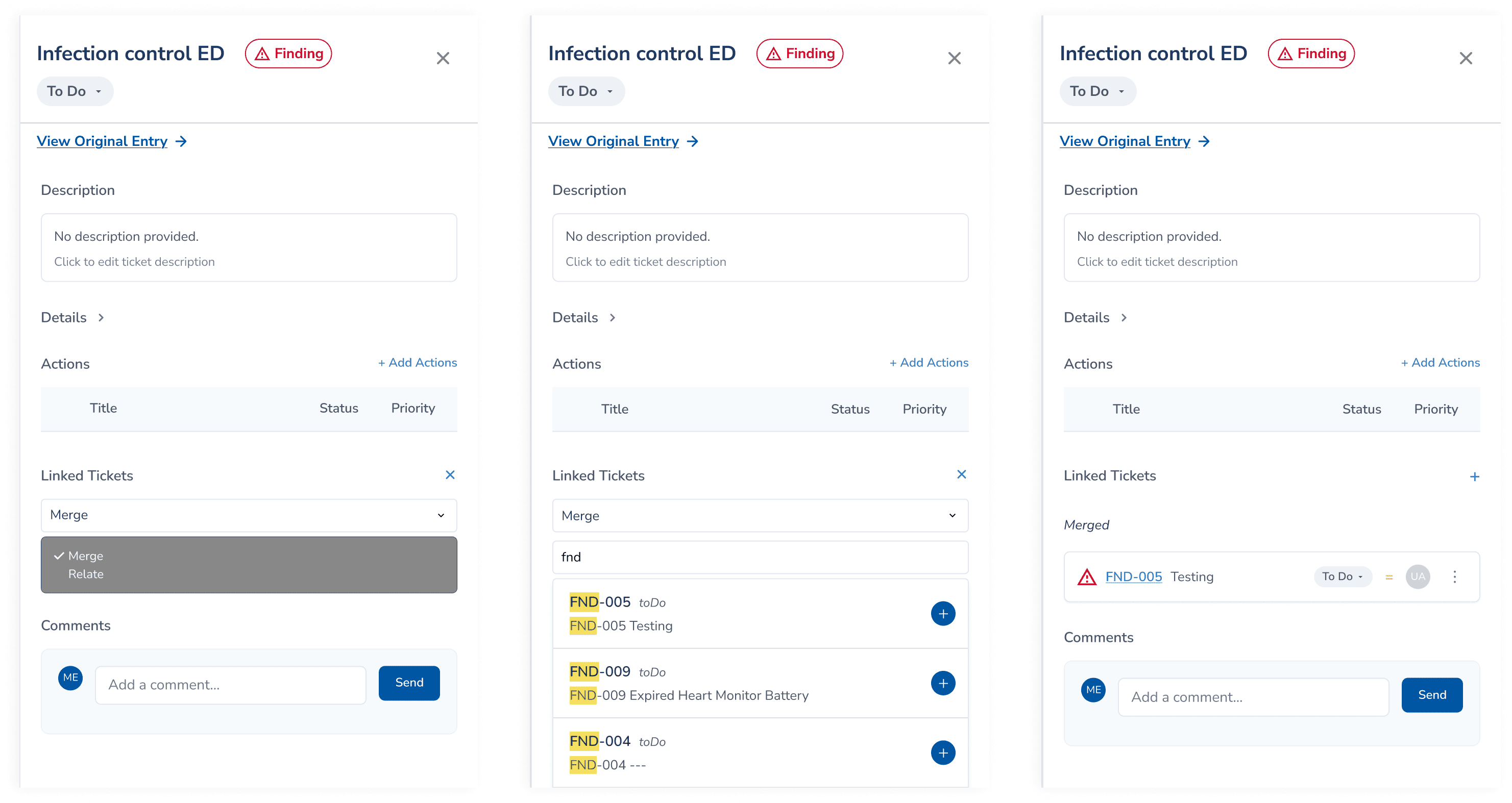
Finding 2: A flow that ran backwards
Task 3: merging two duplicate tickets, had a 62.5% completion rate, but the failures were instructive. Two participants merged in the wrong direction. Another couldn't start without guidance.
Video demo of how participants navigate through the pages in the wrong way
Most participants reasoned from the primary ticket. They wanted to say: "this is the one I want to keep, now let me pull the duplicate into it." The system asked them to do the opposite, starting from the duplicate. Easy to get wrong.
The labels made it worse. "Merged Into" and "Relates to" read as past-tense status rather than present-tense action, so users couldn't tell whether they were describing a relationship or creating one.
One participant said it cleanly:
"Everything is in past tense, so it's, like, as if I was looking for tickets that were merged into this already."
— Participant 8
Recommendation 2.1: Reverse the flow, then rename the labels
Step 1: Select action on the primary record
Step 2: Search and select the sub ticket
Step 3: Confirm
Reverse the flow.
Start the merge from the primary ticket, where most participants reasoned about it from. Users decide what to keep first, then choose what to absorb. This matches the mental model nearly every participant brought to the task.
Rename the labels to match the new direction.
"Merged Into" becomes "Merge." "Relates to" becomes "Relate." Now the words read as actions the user is about to take.
Recommendation 2.2: Surface bulk merge where users expected it
Several participants tried something we didn't expect: they used the table's checkboxes to select both tickets at once, then looked for a Merge action in the bottom toolbar. That toolbar only offered "Change Status."
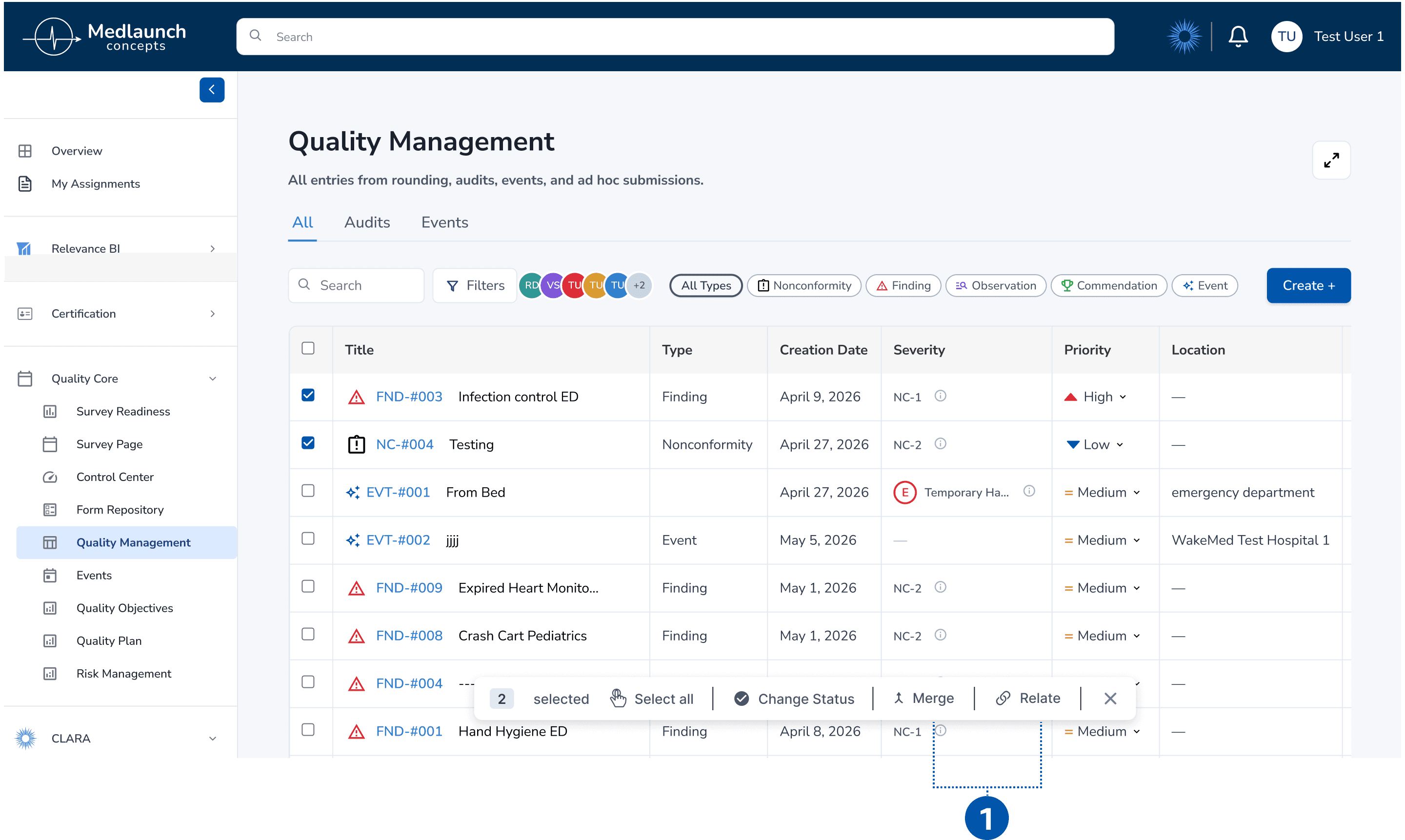
1: Bulk Action Toolbar - ‘Merge’ and ‘Relate’ CTA would appear within the toolbar after the user selects two or more records using the checkboxes.
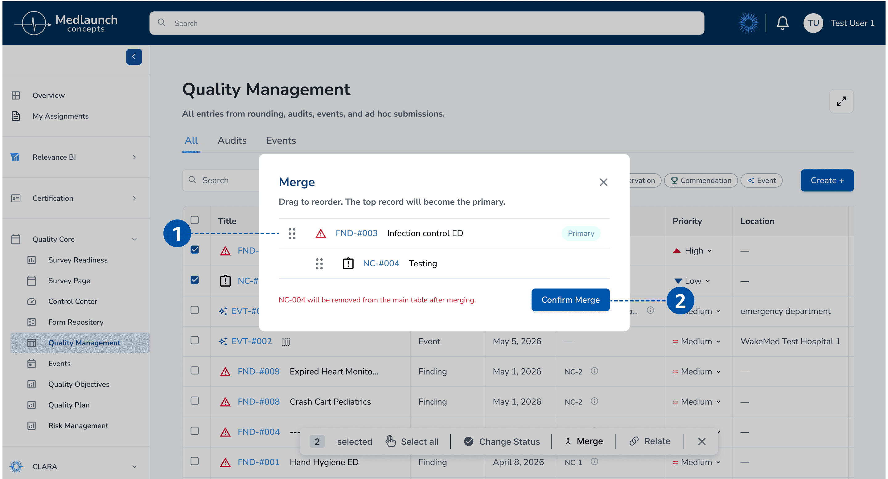
1: Draggable Order - The top record becomes the primary; drag to reorder before confirming.
2: Confirm Merge - Irreversible action clearly labeled, with a warning indicating which record will be removed from the main table
Adding Merge and Relate to the bulk toolbar puts the action where users already thought to find it. A confirmation dialog catches the moment that mattered most: users could drag to reorder, see clearly which record would become the primary, and read a warning about what was about to be removed.
A small contradiction
This is the recommendation I think about most. The fix isn't simpler than the original.
More confirmation, more steps. Does it mean more friction? No! It's richer now: it's more honest about what's actually happening.
Looking back, this was the first sign of the thread we'd pull on in Finding 3.
Finding 3: The split we didn't expect
When we started analyzing Task 4 (reporting a fall event), the team's first instinct was familiar.
The form is long. Users said it felt tedious. Multiple dropdowns, several places where reporters hesitated. The obvious recommendation? Simplify. Shorten the form. Cut redundancies.
Then we looked closer at who was saying what.
The six participants from adjacent fields (the lab manager, the engineers, the product designer, the healthcare-adjacent admins) described the form as cumbersome, overwhelming, repetitive.
But the two participants who actually do this work for a living said something different.
Participant 2, a hospital survey auditor, defended the level of detail:
"I think this input field is helpful because people aren't going to remember. Your average boots-on-the-ground employee, they're not going to remember to put everything. So I think it's good to have these things."
Participant 7, a hospital surveyor, wanted more control. She wanted to assign multiple departments to a single entry. She wanted to edit severity after creation. She wanted detail the form didn't currently capture.
Their complaints weren't "too much." They were "not enough."

Example of Current Input Fields with Incomplete Options
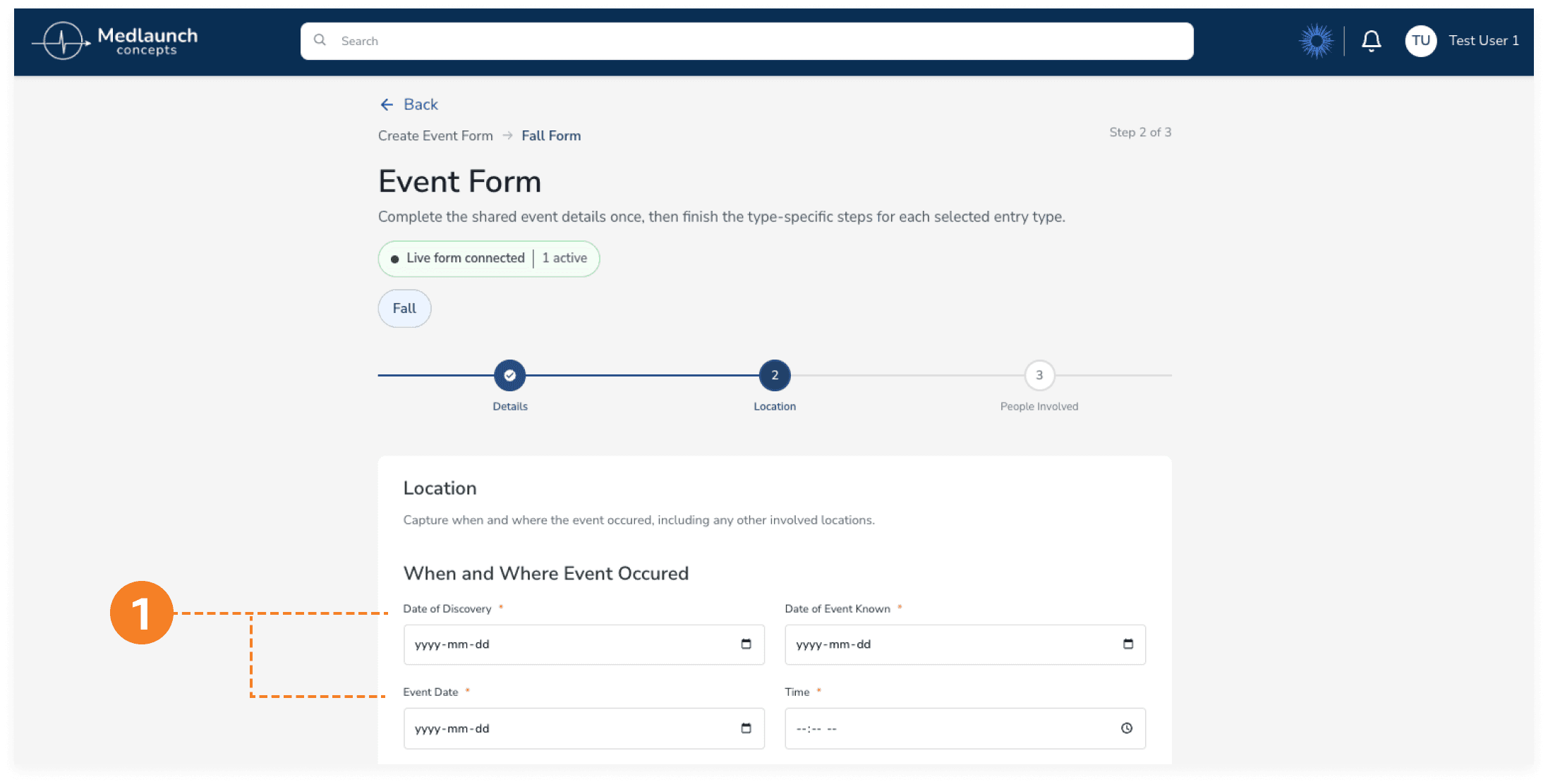
1: Three Date Fields in Close Proximity - "Date of Discovery," "Date of Event Known," and "Event Date".
Challenges and Learning Pt.3
The simplification trap
That split changed how I thought about the work.
The instinct to simplify is a designer's instinct, and it comes from a real place. We had just watched six people get lost. But for the two participants who actually live inside compliance work, what looked like clutter from the outside was necessary structure. Each field corresponded to a piece of information they were trained to capture.
Removing fields wouldn't make the form simpler for them. It would make it less usable.
Recommendation 3: A quieter fix
So the recommendation for Finding 3 isn't simplify the form. It's something quieter and more careful.
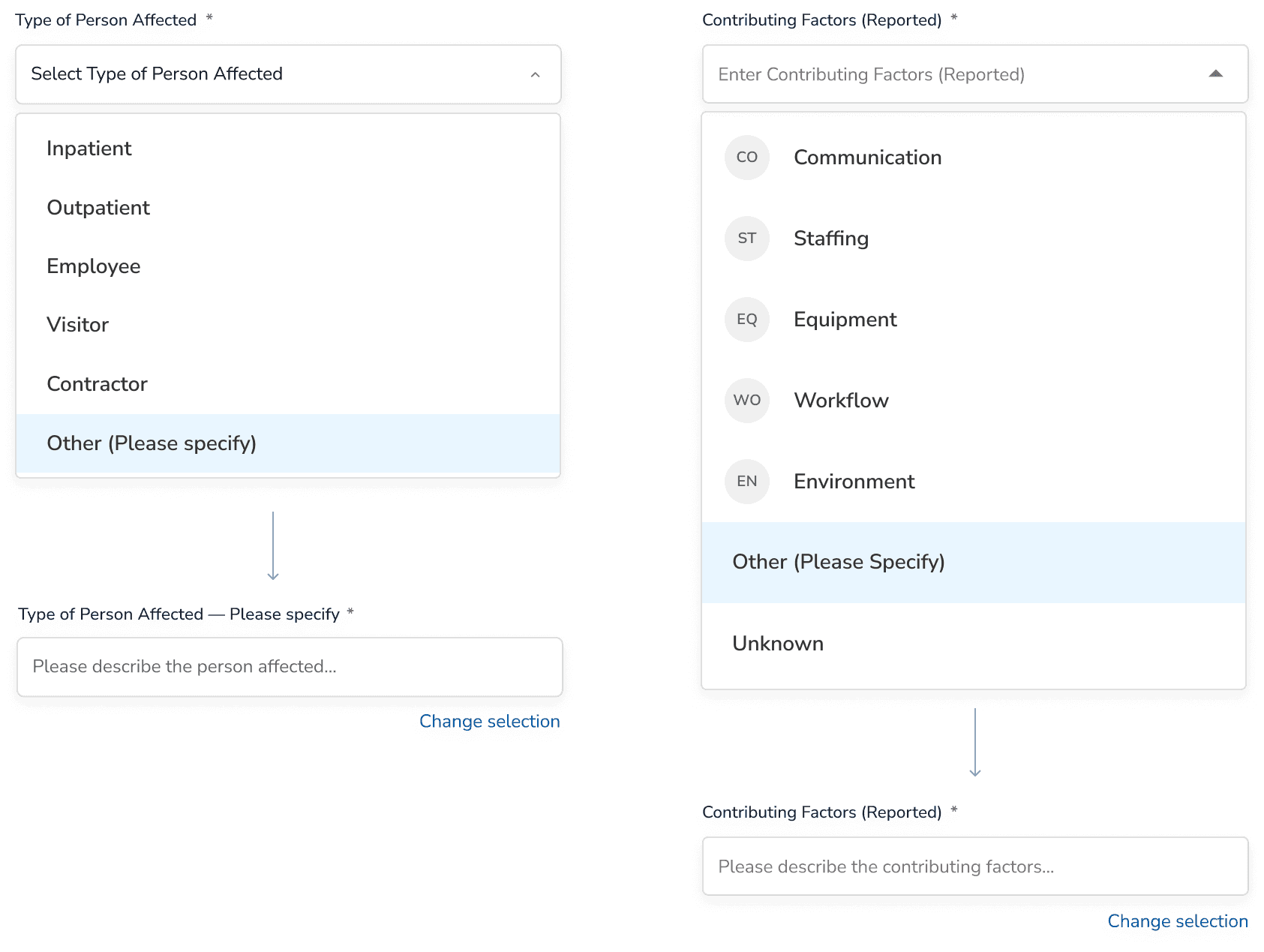
Mock up: Type of Person Affected with "Other (Please specify)" + Contributing Factors with "Unknown"
Add what experts said was missing, instead of removing what adjacent users found heavy.
Participant 2 needed an "I don't know yet." Not because the form was over-detailed, but because it didn't include the option her real workflow requires. Add "Unknown" wherever a reporter might legitimately not know yet. Add "Other (Please specify)" with a free-text follow-up wherever "Other" exists today, so the catch-all actually captures something.

Mock up: Date fields with helper text
Three date fields ("Date of Event," "Date of Discovery," "Date of Event Known") confused everyone, including the direct users. But the fix isn't necessarily to delete two of them. Each one might be doing real work; the form just doesn't say so. Add helper text under each field. Or, if two of them really do capture the same thing, consolidate.
Either way, the question isn't "is this too much?" It's "is each field carrying its weight?"
Wrapping Up
Handing off the research
What we presented and what came next

Moderated Usability Testing Report & Final Presentation
We presented our findings to the client and handed off the full report.
The team walked through the three findings, the supporting quotes and stats, and the recommendations with mockups.
The outcome
The updated Quality Management page after Recommendation 1 shipped.
MedLaunch began implementing Recommendation 1 shortly after the handoff. The hidden scrollbar fix was the lowest-risk, highest-impact change we'd identified, and it was the first to land in the beta build!
Reflection
What I took from this
Three things stayed with me.
The smallest fix is often the biggest catch.
All semester, our professor kept repeating one of Krug's usability rules:

I understood the words. This project is when I felt the rule. Every participant tried to reach Effectiveness Monitoring; none discovered the scrollbar. But now, one-sentence fix. First to ship!
Language is part of the interface.
"Merged Into" reads as a past-tense status. "Other" without a follow-up captures nothing. "Not applicable" doesn't mean "I don't know yet." When the system gives users no way to be precise, they get it wrong or stop trying.
Don't mistake unfamiliarity for complexity.
We came in wanting to make the platform easier. The people who actually use it didn't want easier. They wanted legible. They wanted the system's complexity to match the real complexity of their job. The best usability work for a system like this isn't simplification. It's translation.